Use your cover to highlight your community college and programs.
More than anything else, the cover image you choose for your issues of CareerFocus magazine will influence whether it is read and spread in your community. Because of this, choosing a good cover image can be a moment of stress for some colleges. You want to choose an image that represents your community college, is warm and welcoming, and forms an attractive cover image layout.
Knowing whether an image will meet these criteria can be challenging. If you’re uncertain about what to look for, here are seven tips to help you find the right cover image for your next CareerFocus issue.
1. Think about where other cover elements will land.
You may have a great image, but what will it look like once you add your cover title, headlines, and content preview text? It’s important to remember that your cover image won’t appear alone. There will be other elements, and if you pick a photo with a little extra room around it, it will be easier to overlay text.
That said, it’s OK if the text covers up some parts of your image. Overlapping visual elements are a standard part of cover designs. So long as your text doesn’t obscure anything crucial, you should be fine.
2. Make sure the image resolution is high enough for print.
The resolution of your cover image will affect how crisp the printed product is. While many digital cameras take photos at a resolution of 72 dpi, the standard for print is much higher—closer to 300 dpi. Anything less, and you risk printing a grainy image that can cheapen the appearance of your magazine.
Of course, the higher the dpi, the larger the file size. Images that are for digital use only don’t need to be higher resolution, because of screen resolution limitations. Furthermore, large images can be slow to load online, and take up more space on servers and hard drives. Context is important: choose high resolution images for print, and lower dpi images for digital.
3. Leave plenty of white space to avoid overcrowding.
One common problem some colleges have when choosing their cover photo is to become overzealous in their image cropping and composition. They choose a tight framing of the image that takes up most of the cover space, and then want to fill much of the rest of the cover space with headlines or other text. Or, they can’t choose just one image, and try to submit a collage of various photos instead.
The result is a confusing, crowded design that fails to adequately represent the college in a pleasing way. It’s far better to choose a cover image with some breathing room. The more elements on a cover image, the more they distract from each other.
4. Vary your subject matter.
Some community colleges develop a formula, whereby every issue they produce features a mid-range shot of a cluster of students sitting on the grass in front of their community college sign. It looks nice, but used too frequently and it can become repetitive.
You don’t need to choose the same type of image for every issue of your magazine. In fact, offering different kinds of images allows you to showcase a different aspect of your community college with each issue. Images of your students enjoying campus life can be a great choice. So can a single hero shot of a faculty member or a student. It’s fine to have an overall style for your issues, but if they look too much alike from issue to issue, it may be easier to ignore them.
5. Tips for choosing a campus shot.
Pick a location that is easily recognizable as your facility. You don’t need to take a picture with your sign in it, but a campus landmark or a prominent building are usually good choices for subject matter.
Don’t limit yourself to exterior shots, either. Indoor lobbies or study areas can also be attractive feature images. The goal of a good campus shot is to give your readers a recognizable location, so that if they decide to come visit your campus, they can see the same buildings and indoor spaces featured in your cover image.
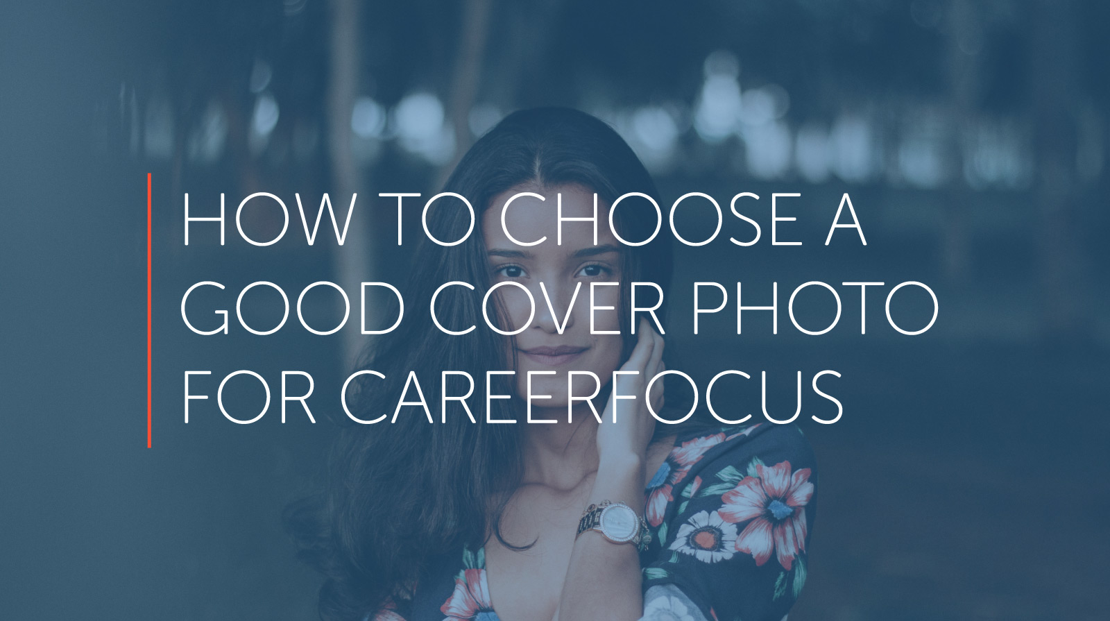
6. Tips for choosing a person-centric shot.
Students are great subjects for cover shoots. Not only does it give the student a boost of pride to see themselves featured on the cover of your CareerFocus magazine, it also helps for your readers to see someone relatable attending your college. In many cases, new enrollees site feature stories of other students as one of the factors that inspired them to sign up for classes. The way they see it, if the featured student could do it, so can they.
Faculty can also be a good choice for cover photos, particularly if they’re shown in their classroom. It helps students to see who their instructors might be, and can make the prospect of attending class feel less daunting.
7. Avoid stock photos: take your own pictures!
If you’re under a time crunch, you may be tempted to grab a stock photo of smiling college students off a stock image site. The photo may look professional and welcoming, but it won’t represent your institution. Rather than engage potential students, you’re more likely to be dismissed as a brochure or catalog.
Instead, take the time to shoot quality photographs of your own faculty, students, or campus. If your community college offers photography classes, you could even make it a student competition. The winners may be excited for a chance to show off their work, which can increase the word-of-mouth spread of your program.
A good cover photo builds engagement and changes perceptions about your institution.
Community colleges often suffer from misleading perceptions about their campuses and facilities. CareerFocus is an opportunity to showcase your college in a different light. By using photography of your campus grounds, classrooms, students and faculty, you give readers an inside look at what attending your community college might be like.